
Why does website speed matter and how to speed up your website?
The mobile-first approach to building a website has been discussed and recommended for a while now. According to Statista mobile traffic has steadily dominated the desktop traffic for nearly the last two years.
With users accessing the internet from a wide variety of devices and internet connections (yes, 3G is still a thing) optimizing for website speed, or rather performance in general, has become a critical aspect of building a website.
If it weren't enough, studies show that people tend to get much more easily distracted than ever before.
What does all of this mean for you? In general, you should try to make your website load as quickly as possible, otherwise your site visitors might give up and leave your site without seeing your content at all.
Let's take a look at some hard data:
"Walmart found that for every 1 second improvement in page load time, conversions increased by 2%."
Reducing the perceived wait times by 40% has improved Pinterest's sign up conversion rate by 15%.
More than 50% of visits are abandoned if a mobile site takes more than 3 seconds to load.
Now, it should be clear to you why the speed of your website really matters. So, let's take a look at some of the most important website speed metrics and find out how you can measure those.
Core website speed metrics
The key website speed metrics have changed many times in the past few years. In 2020, Google's Core Web Vitals initiative was started and has become a de facto standard since then. It gained major importance in May 2021 when Google started factoring the 3 core metrics of its Core Web Vitals into their ranking algorithm.
Let's take a quick look at those 3 metrics.
Largest Contentful Paint (LCP)
The Largest Contentful Paint captures the time required for the largest block element (such as an image, text, or video) in the visible viewport to be rendered.
This might sound a little abstract, to make this clear we've captured the Largest Contentful Paint elements (highlighted in blue) for 4 different websites::
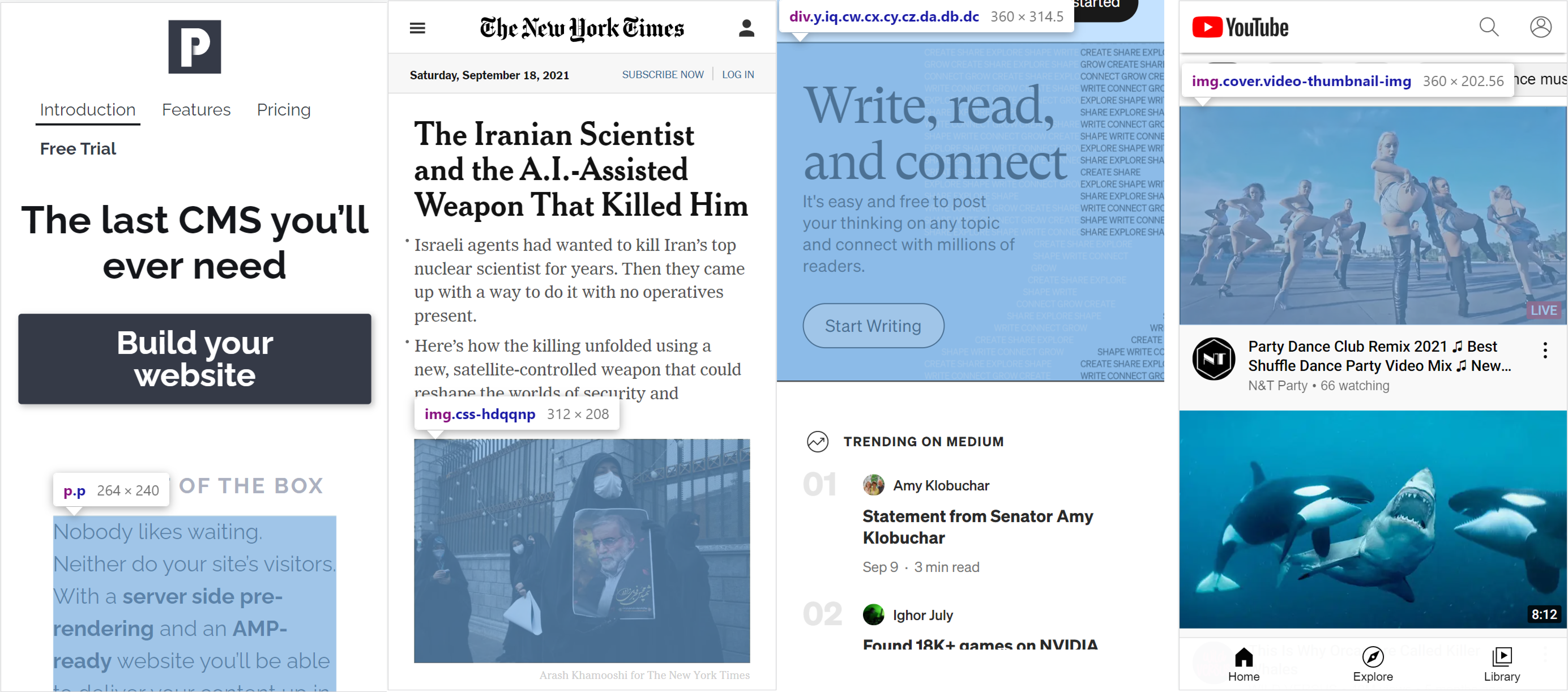
In the screenshots above, you can see that the elements considered to be the Largest Contentful Paint nodes are mostly large blocks of text, or images. Those aren't always necessarily the most important elements on the page, but they always have a big impact on the perceived content and could significantly influence the first impression the website makes on its visitors.
It is critical that the users of your website see those blocks as soon as possible. According to Google, the Largest Contentful Paint should occur in under 2.5 seconds on both, mobile and desktop. If it takes more than 4 seconds for the LCP to occur, you simply need to start optimizing the speed of your website today.
Web.dev highlights the following 4 key factors having a negative impact on the LCP:
Slow server response times
Render-blocking JavaScript and CSS
Slow resource loading times
Client-side rendering
We will go into more details on how to optimize those 4 factors later in this post.
First Input Delay (FID)
The First Input Delay captures the time required for the page to start responding to user interactions (e.g. scrolling or clicks). According to Core Web Vitals the FID should ideally not exceed 100 ms. Every First Input Delay exceeding 300 ms will result in a poor user experience.
First Input Delay has replaced the Time To Interactive (TTI) metric, which gives an interval between the start of the page load and the first interactivity.
Both metrics, First Input Delay and Time to Interactive, will give you very similar insights. The major difference between those two metrics is FID being based solely on real usage statistics (real user interactions), while TTI can be measured artifically.
The main factor having a negative impact on the First Input Delay are long JavaScript execution times. Heavy JavaScript code might be blocking the main thread resulting in the browser not being able to respond to user interactions.
Cumulative Layout Shift (CLS)
The Cumulative Layout Shift metric measures the visual stability of an interface. It is the largest sum of an unexpected burst of layout shifts within the entire lifetime of the page. A single layout shift occurs whenever a visible element on a page changes its position.
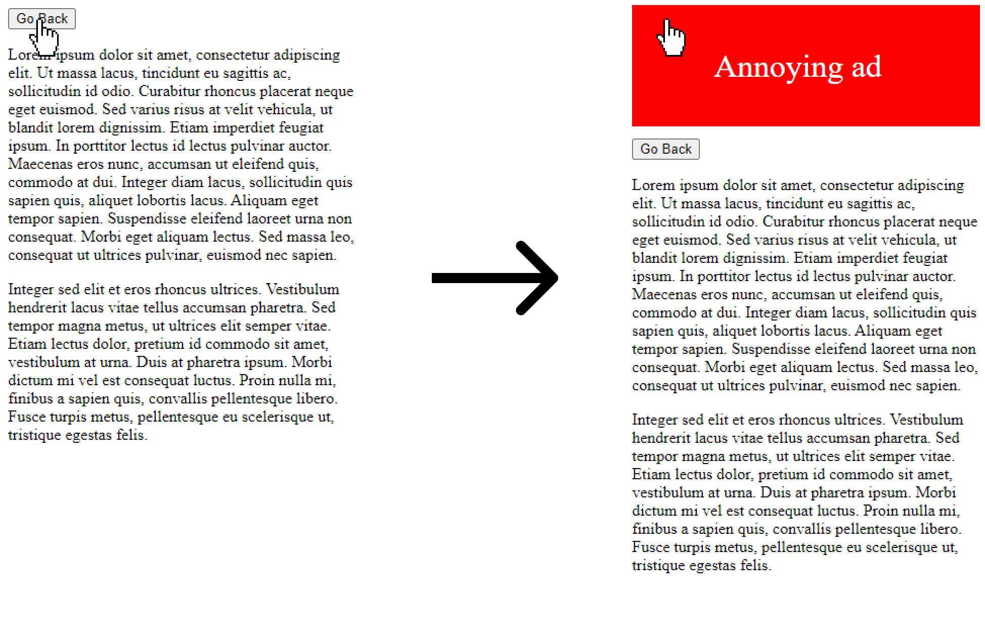
Did you ever want to click a link on a website, and then suddenly the button has changed its position and you clicked an ad instead?
Then you've experienced a layout shift. Layout shifts can get very annoying and mainly impact the user experience rather than the speed of the website.
In the example below, the user is about to go back on a page, but just before the user clicks the back button, an ad appears at the place of the button (and if the user was unlucky enough, then a redirect to the advertisers site will follow).
According to Core Web Vitals a good CLS score is a number below 0.1, and everything above 0.25 is considered to be a poor value.
Luckily, there's an easy way to such avoid layout shifts:
Always define aspect ratios of images directly in the markup (by setting the width and height attributes, that way the browser can reserve space for the image and won't have to move elements out of their current place).
Never insert content above existing content (unless it's in response to a user interaction).
Use skeleton loaders instead of standard loading animations.
Make sure that your webfonts do not cause major repaints of the page.
Let's briefly summarize the Core Web Vitals:
Largest Contentful Paint (LCP) — measures the time for the largest block element in the visible viewport to be rendered. It should not exceed 2.5 seconds and is negatively influenced by slow server response times, render-blocking assets, and client-side rendering.
First Input Delay (FID) — measures the time the page needs to start responding to user interactions. It should not exceed 100 ms and is negatively influenced by long JavaScript execution times.
Cumulative Layout Shift (CLS) — measures the visual stability of an interface. It is a relative value which should not exceed 0.1 and is negatively influenced by not reserving space for images and other assets, inserting content above existing content, and poor usage of webfonts.
Lighthouse score and other metrics
There are many other website performance metrics that might be helpful if you're trying to optimize the speed of your website. One of them is the Lighthouse Performance score which projects the score of different metrics into a single number between 0 and 100, with 0 to 49 being a poor score, 50 to 89 indicating necessary improvements, and 90 to 100 being a good score.
The above mentioned metrics will give you a good idea of what you need to improve and how your website is doing, but let's take a look at a few other numbers that might be helpful if you're targeting a specific issue:
Time to First Byte (TTFB) — describes how long it takes for the first byte of content to reach the browser. Long TTFB will usually indicate that either your server needs too long to respond (e.g. it takes too long to generate the content), or that the physical location of the server is too far away from the end user (in that case you can use a CDN to solve the issue). Ideally, the Time to First Byte should be kept under 200 milliseconds.
First Contentful Paint (FCP) — describes how long it takes the browser to render the first part of your page after a user navigates there. A long FCP (everything above 3 seconds) will usually indicate a lot of render-blocking styles and/or scripts, or your text not being visible while webfonts are loading.
Total size of downloaded content — okay, let's be honest, this is not really a website speed metric, but it can indicate some of the issues impacting the performance of your site. Ideally, your page should load just a few hundred kilobytes (at least before the user starts interacting with the page). If the initial page load exceeds a few megabytes, then you should make sure that your assets are being minified and images lazy-loaded.
How to measure website speed?
There are plenty of tools that will help you measure and improve the speed of your website, here are some ouf our favorites:
PageSpeed Insights — are the number one tool if you want to quickly test the speed of your website. It will show you a rating for a handful of important speed metrics and will give you some suggestions to optimize those. And if your website has sufficient traffic, it will also show you field data from real users.
Lighthouse — will give you very similar information to PageSpeed Insights.
Pagespeed.cz — even though this tool mainly aggregates data from PageSpeed Insights, it is our favorite tool for a very simple reason, it will track the speed of your website over a period of time, you can compare your site with competitors, and even subscribe to monthly digests.
Speedcurve — is the tool to go with if you're not on a tight budget. It gives you the speed data over a period of time, you can compare the speed of your website with competitors, define performance budgets, alerting and more.
How to optimize the speed of your website?
Let's now take a look at a few key optimizations you can make to improve the speed of your website. We'll start with a few simple quick-wins and will wrap up with optimizations that might require a little more effort to get implemented.
Enable compression
Before you start optimizing your code and assets, you should make sure your server compresses all text files (like html, css, js, and others). By using the gzip or brotli compression when serving your content, you can save a big portion of data that would otherwise get transferred unnecessarily. And that means that the page will load and render faster.
Let's take a look at a few examples:
The HTML of our homepage is 14.6 kB uncompressed, after gzip compression, it is only 3.8 kB. That's 74% savings in the size of transferred data.
The New York Times homepage HTML is 1.2 MB before gzip compression, and only 217 kB after compression, that's 72% savings.
The stylesheets of Medium.com are 12.1 kB before gzip compression, and only 1.3 kB after compression, that's almost 90% savings.
Enabling the gzip compression is a simple website speed optimization that can be implemented within a few minutes. There is simply no excuse for serving uncompressed content.
Lazy-load your images
Images are usually one of the heaviest assets on the site. Especially on mobile, not loading all images at once can be critical to improve the user experience. Rembember, mobile data is still limited. And if you don't care about the data consumption of your site visitors, you should keep in mind that image rendering also takes resources. And that might result in a laggy behavior, especially on lower-end devices.
Let's take Best Buy's mobile homepage as an example, this page loads around 0.8 megabyte of images on the initial load (at the time of testing), without lazy-loading the homepage would load 1.4 megabyte of images. This is almost 100% increase, and in this case we're not really talking about an image heavy page.
By implementing lazy loading on your images (and other resources like embedded videos,…) you can decrease the mobile data consumption and also optimize the usage of the device resources. Just keep in mind not to lazy-load critical images (mainly the images above the fold), otherwise you could negativelly influence your Largest Contentful Paint.
In modern browsers, lazy-loading can be implemented pretty easily — you just need to add the loading="lazy" attribute to your image or iframe and let the browser take care of loading the asset once it is required.
If you also need to support older browsers, you can use one of many available libraries (for example the MiniLazyload), customize our boilerplate code to match your needs, or just start using the Phaistos CMS, as we already support lazy-loading within our platform and also generate a blurhash for each image to ensure a smoother user experience on slower internet connections.
Make sure your JavaScript and non-critical CSS isn't render-blocking
Render-blocking scripts and stylesheets can significantly delay the First Paint and consequently also the Largest Contentful Paint. That doesn't mean you should completely avoid render-blocking scripts and stylesheets, but always make sure you only load the critical assets and try to keep them as compact as possible.
Ideally, none of your scripts should be loaded synchronously, and the size of downloaded HTML and CSS required for the first paint should not exceed 14 kilobytes.
To take everything even further, you can also split your styles into multiple stylesheets (based on your components) and load them in the body only once those are required. This will allow the browser to render everything above your component, where it pauses to download and parse the component's stylesheet.
Let's take a look at an example:
<!-- BEFORE -->
<html>
  <head>
    <!-- ... -->
    <!-- Render-blocking chat widget -->
    <script src="/js/chat.js"></script>
    <!-- All styles in a single bundle -->
    <link rel="stylesheet" href="/css/bundle.css">
  </head>
  <body>
    <p><!-- ... --></p>
    <p><!-- ... --></p>
    <ul class="gallery"><!-- ... --></ul>
  </body>
</html>
Now let's see how this could be improved:
<!-- AFTER -->
<html>
  <head>
    <!-- ... -->
    <!-- Styles required for the initial rendering -->
    <link rel="stylesheet" href="/css/critical.css">
  </head>
  <body>
    <p><!-- ... --></p>
    <p><!-- ... --></p>
    <!-- Image gallery styles,
         do not block rendering until browser gets to this part of the markup -->
    <link rel="stylesheet" href="/css/gallery.css">
    <ul class="gallery"><!-- ... --></ul>
    <!-- Chat widget can be loaded after the page finishes rendering -->
    <script src="/js/chat.js" defer></script>
  </body>
</html>
Take advantage of client-side caching
Client-side caching can significantly improve all subsequent page-loads. For example, if your user has already visited your homepage yesterday and comes back today, then most of your styles, scripts and other static assets could already haven been persisted in the browser's cache.
That means that the browser won't have to load the resources again, which results in the browser being able to start rendering your page (or parts of it) without having to wait for the download of those assets to be completed.
Of course, assets can change over time (especially your styles, or scripts) and you don't want to serve outdated (or broken) styles to your site's visitors. To solve this, you can append the file hash to the file name, so whenever your asset changes, its url in your HTML will be updated and the browser will load the updated asset. For example the stylesheet critical.css can become critical.43b0f008a94f65294740ffccf56869fe.css.
Appending the file hash to its URL has another significant advantage, you can set an (almost) unlimited lifetime and let the browser decide when to throw the file away.
The Phaistos CMS does all those things for you, but if you need to adjust the content caching in your particular backend, you can simply set the Cache-Control header to the desired value (e.g. max-age=31536000, public to cache the assets for a year).
If your content is not too dynamic, you can also decide to cache the entire markup of your pages, meaning the content wouldn't have to be requested by the browser when the users comes back to the same page. Our CMS implements an hybrid approach to HTML caching — you can decide to cache your HTML for a certain period of time, once the lifetime of the cached page expires, we will check whether it was changed after being cached, and will invalidate the cache only if necessary.
Minify your JavaScript and CSS
By minifying your production scripts and stylesheets you can significantly decrease the size of those files. Minification not only removes all unnecessary characters like spaces and comments, but also shortens the variable names and replaces all long expressions that have a shorter form (for example you might be using full hex codes to improve readability of your css, but #334455 can be shortened to #345 in the minified version of your styles).
Let's take a look at two popular libraries:
The size of unminified jQuery 3.6.0 is 289 kB (85 kB after gzip compression). The minified version only needs to download 89.5 kB (31.1 kB after gzip compression). That's 73% savings for the compressed version.
The size of Bootstrap's css bundle is 28 kB (after gzip compression) and 25.7 kB after minification. That's 9% savings.
To minify your assets, you can use one of the many free tools available online (e.g. UglifyJS for your scripts and JS & CSS Minifier for your stylesheets) or integrate the minifications directly into your build flow (e.g. with Webpack).
The Phaistos CMS does minify all stylesheets, scripts, SVG images and your HTML markup for you, without you having to set up a single thing.
Optimize your webfont loading
When using webfonts, the browser usually waits until the font is downloaded before displaying any text. This can result in a scenario when the browser is ready to render your content after downloading all blocking assets but still waits for your webfonts to be downloaded.
By choosing the right system font as a fallback and adjusting the font-display property, you can make the browser display the fallback font first, significantly improving the timespan between the page load and the time when the user sees the content.
Let's take a look at an example:
/* Before */
@font-face {
	font-family: 'Raleway';
	font-style: normal;
	font-weight: 400;
	src: url(/raleway.woff2) format('woff2'),
	url(/raleway.ttf) format('truetype');
  }

body {
    font-family: Raleway;
}
This can be optimized by adding the font-display: swap property and adding at least one fallback font:
/* After */
@font-face {
    font-family: 'Raleway';
    font-style: normal;
    font-weight: 400;
    src: url(/raleway.woff2) format('woff2'),
         url(/raleway.ttf) format('truetype');
    /* Make the browser render system fonts first */
    font-display: swap;
}

body {
    /* Add system fonts as a fallback */
    font-family: Raleway, Trebuchet MS, Avenir, Segoe UI, sans‑serif;
}
If you want to take everything even further, you can also instruct the browser to preload your webfont directly in the head tag and potentially improve the loading of your webfont by another few milliseconds:
<link rel="preload" href="/raleway.woff2" type="font/woff2" as="font" crossorigin>Optimize your images and provide appropriatelly sized versions
As we've already mentioned, images are usually one of the heaviest assets on your wbesite. With a few optimizations you can make sure your images don't result in a poor user experience and loading times.
In the first place, you should always provide appropriately sized images. Your users don't need to see an 8K image on a 5 inch screen. Not only does the full sized image need longer to be downloaded and displayed, the browser also needs to use the device resources to downscale it and display it in the actual view size. And that can prove pretty costly, especially on lower-end devices.
You don't have to provide a dedicated image for every possible device resolution, but at least make sure not to serve oversized images. Downscaling your 8K image to Full HD is already a big win. Of course, if you have at least two image sizes, one for mobile, and one for desktop, that's even better. To cover most of the common device resolutions, our CMS generates 4 image versions in two pixel densities for you. The appropriately sized version — based on the device resolution and the pixel density — is then being loaded.
If you decide to load the appropriately sized image yourself, here is a code snippet that you can simply reuse for your particular use-case:
<picture>
    <!-- Load large.png for viewport width >= 1024px -->
    <source media="(min-width: 1024px)" srcset="large.png">
    <!-- Load medium.png for viewport width >= 600px -->
    <source media="(min-width: 600px)" srcset="medium.png">
    <!-- Load small.png on all smaller viewport widths -->
    <img src="small.png" alt="Image description">
</picture>
Unfortunately, a small image won't necessarily result in a small file size. Always make sure that your images are properly compressed, and if you can, then also provide alternative images in some of the modern formats like WebP (which is now broadly supported). Modern formats will usually result in a smaller resulting file size, or at least in fewer compression artifacts/compromises for a similar file size.
Phaistos CMS makes sure to optimize the original versions of your images, and also generates alternative images in the WebP (usually around 30% smaller compared to JPEGs) and AVIF (the latest modern format that is currently hitting the browsers with around 50% file size reduction compared to JPEGs) formats.
Alternatively, you can also optimize your images with services like Cloudinary or, if you're not uploading images frequently, use good old manual conversion tools and load the supported image version with the following code-snippet (which you can combine with the code-snippet above):
<picture>
    <!-- Load img.avif in browsers that support the AVIF image format-->
    <source srcset="img.avif" type="image/avif">
    <!-- Load img.webp in browsers that support the WebP image format-->
    <source srcset="img.webp" type="image/webp">
    <!-- Load img.jpg in browsers that do support neither of those -->
    <img src="img.jpg" alt="Image Description">
</picture>`
Sign up now and start using a CMS that cares about the speed of your website
Start your free trialUse a CDN
Using a Content Delivery Network (CDN) can improve the loading speed of your website, especially if your site visitors come from all around the globe. A CDN, like Cloudflare, makes sure to serve your static assets from the nearest available server, resulting in shorter times to first byte and loading times in general. It can also help you reduce downtimes and protect against DDoS attacks.
Remove unused scripts and styles
Loading a lot of JavaScript and CSS you don't end up using, not only increases the size of your site, it also adds more content that the browser has to parse and process. Chances are, that you're loading a large library and only use a small part of it. Or your stylesheets might have simply accumulated a lot of outdated code over the time.
Removing unused scripts and styles is a process that will take some time and resources (especially for older projects), but it will definitely be worth the effort.
Here are a few guidelines that might make the job easier for you:
If you're using Webpack (or other bundler), do not import whole external libraries, only require what you actually end up using.
Try to find a lighter alternative to a large library you are using. Are you using a library to display a lightbox? Do you really need all the features and transitions, or are you only using a small portion of what the library offers? Maybe finding an alternative, or writing your own reusable code, is the way to go. Try not to go with the swiss knife solution, cherry-pick a solution that fits your specific needs.
Are you integrating a library or a plugin only a small portion of your site visitors ends up using? Can you load it only when a specific action occurs? For example, if only a few users interract with your chat widget, then you might want to load it after they hover over a chat icon (or maybe even after they click it).
Split your stylesheets into multiple smaller chunks (based on your page types, or even components) and load only what you need. For example our CMS only loads the category stylesheets on category pages, but they're not included on the homepage.
Provide an AMP version of your site
AMP stands for Accelerated Mobile Pages and is a framework provided by Google. Its intention is to provide a version of your site that is optimized for mobile devices. The AMP framework has also found its way to e-mails, and other parts of the web, but that's not in the scope of this post.
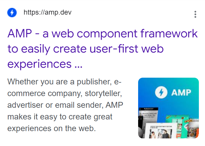
Maybe you've seen a flash icon in Google's search results. This marks that the link will take you to an AMP page:
The main advantage of an AMP version of your website is that it might be preloaded and pre-rendered even before the user clicks the link (e.g. within Google's search results), which will ensure an almost immediate load of your page (you can get to times that are simply not achievable with a standard site).
Even though an AMP version of your site might result in better load times for some of your users, it's not a must-have for everyone. It does take some implementation effort (unless your CMS supports this out-of-the-box, and yes, Phaistos does generate AMP versions of your pages for you), and has its limitations.
Before you start implementing an AMP version of your site, make sure it justifies the development cost. We would recommend this for sites that can expect a big portion of their traffic from Google's search results. Also remember, the AMP version of your site should provide a similar (if not the same) user-experience and features as your standard website.
You can also decide not to provide a standard website, but to go with AMP for the default version of your site. Just note that this won't necessarily make your site faster for everyone. AMP is a JavaScript heavy framework and chances are that it will perform worse than your normal site when the browser doesn't preload and prerender the page (e.g. standard navigation on your website).
For example our standard homepage loads 328 kB of resources (before compression) and has a LCP of 2.0 seconds, the AMP version of our homepage loads 496 kB of resources and has a LCP of 2.6 seconds (both LCPs are artifical measurements).
Speed up markup rendering
Putting together your markup on the fly can prove pretty costly when talking about the performance of your website. If you're using any PHP based CMS like Wordpress, your content doesn't get stored in static HTML files, but it gets generated when the page is requested.
This means that before the first byte hits the browser, the CMS has to find the right database entry, load the data, build the HTML and then first it can start sending it to your site visitors.
The advantage of this approach is that you can modify your templates or content, and all changes get immediately reflected for everyone who tries to access your website. On the other side, generating the content when it's requested can take a lot of time, especially if thousands of people are trying to access your content simultanously putting a lot of load on your server.
If you're rendering your content on the fly, make sure to optimize all your database queries and all components that are involved in the content rendering. Especially if the Time to First Byte of your HTML exceeds 200 milliseconds.
Nowadays, putting together the markup on the client side is becoming more common. While JavaScript frameworks like Vue.js or React are great and can simplify and streamline the development, those are more suitable for feature-rich web application than for common websites. If you can, try to deliver the final markup instead of compiling the HTML with JavaScript, otherwise you can negatively impact your LCP.
Our CMS does prerender and prepublish the markup of all your content pages whenever you change your templates or update some content. This can result in slight delays between the time you made the changes and the time the changes get published (those delays should not exceed a few minutes), but serving static HTML pages will always provide the best results in terms of loading times, even if a lot of people are accessing your content at the same time.
Preload critical assets and content users are most likely to see
Preloading critical assets can help you improve the performance of your website.
Let's say your Largest Contentful Paint element is an image. In that case you can instruct the browser to start loading it even before the browser discovers the image tag. This can save you a few milliseconds, especially if the image is being injected by a script.
<link rel="preload" as="image" href="important.png">You can also decide to preload entire HTML pages and thus serve the markup immediately after the user cliks an internal link on your website. This can prove useful if there's a high probability that your site's visitors will visit a particular page (e.g. your contact page or your last post).
Independent of the technique you're going to use, always make sure not to overuse content preloading, otherwise you might waste the browser's resources and load unnecessary files.
With the Phaistos CMS you can choose specific posts or pages, or a specific number of latest posts, that should be preloaded and cached once a user hits your site.
Key takeaways
Let's summarize what we've learned in this post:
Improving the speed and performance of your website will not only improve the user experience, but can also have a positive impact on your business metrics.
Google's Core Web Vitals are the de facto standard when measuring the website speed — LCP measures the time required for the largest block element in the viewport to be rendered; FID measures the time your site needs to start responding to users' interactions; and CLS measures the visual stability of your interface.
You can measure the speed of your website with tools like PageSpeed Insights — those will give you an assessment of your website speed and will help you improve it.
Always make sure to enable gzip or brotli compression.
Lazy-load and optimize your images, serve those in appropriate sizes and in modern formats.
Reduce the size and number of render-blocking stylesheets and scripts, minify those.
Enable client-side caching.
Try to completely avoid client-side rendering, speed up server-side rendering.
Phaistos CMS is a content management system that is built with website speed in the main focus.
Any questions or feedback? Do you need help getting started with the Phaistos CMS? Just let me know at [email protected].